🇪🇦 Puedes encontrar una versión de este caso de estudio en español en este link
Background
The app Mi Movistar (Android/iOS/Web) is the application used by Movistar's customers in Spain (the biggest Telco in the country). This application was customized to be leveraged by other brands of the company. From this tool, it is possible to manage all the lines and services of the paid or prepaid contracts as well as the management of the Movistar+ TV packages.
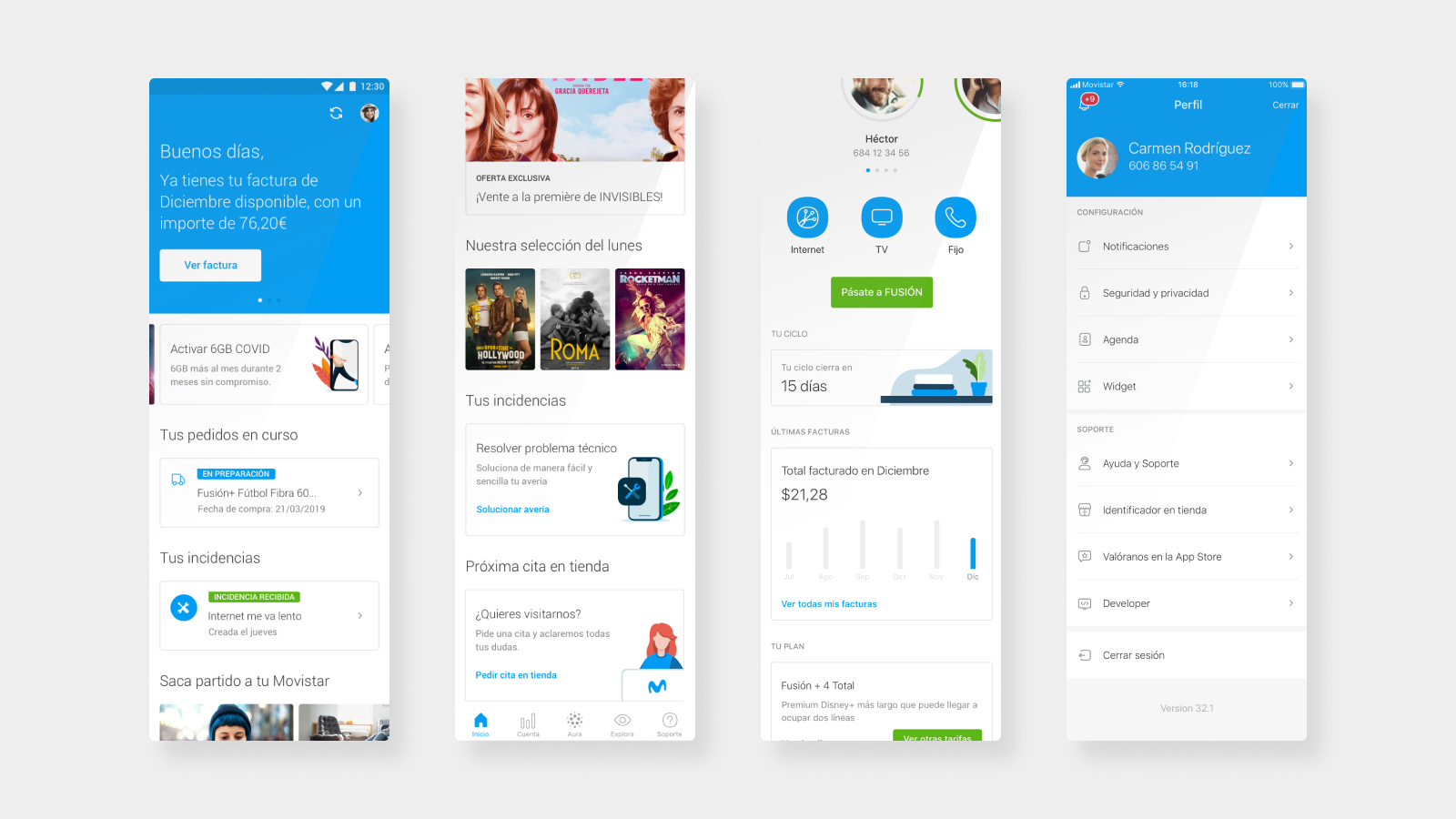
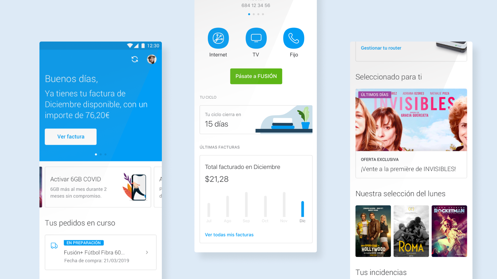
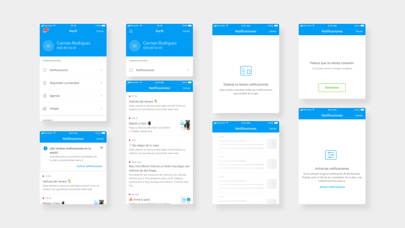
There was a need of comunication to the clients within the Mi Movistar app in an agile way and less intrusive as possible. The objective was to send short notifications, alerts, promotions or any type of relevant information to the customers. In addition, notifications are stored in the app, like for example an inbox, so customers can read later.
Mainly, the similar processes that already existed and were used in other applications to send notifications within their apps and store them were taken as a reference, since it was a system known by the user and identified in a natural way.
Goals
As the first version of the feature, a series of use cases were defined, thinking of having the functionality available as soon as possible. And on the other hand, in the same project, a second part of future improvements and modifications was defined, taking into account what has already been learned from the experience and the metrics of the first phase.
Use cases
The user must be able to receive any type of notification that allows direct interaction when the application is closed (push notification).
The application must have a place where the notifications received are saved and these can be consulted later.
The user can perceive by means of a counter, icon or button the amount of unread messages, placed in a relevant and meaningful position within the architecture of the application.
The user must know which notifications he receives, which he has not yet read and which he has.
The user can interact at any time in the life cycle of the notification to go to the place where the action occurs or is proposed; or in the case of being informative, allow a link.
Elements and requirements of the notification and the inbox
The notification component can contain images; and in the text, emojis, bold or italic (markdown syntax).
The notification includes the time, in the first 24 hours; the day of week, in the first week; and the day of month if more than a week has passed since the notification was received.
The notification text is composed of a title and a body text.
The text is limited to 15 characters in the title and 150 characters in the body text.
It is necessary to design empty states screens when there aren't any notifications or connection with the server doesn't exist.
There must be a screen for visualizing visual content, all kind of images or videos.
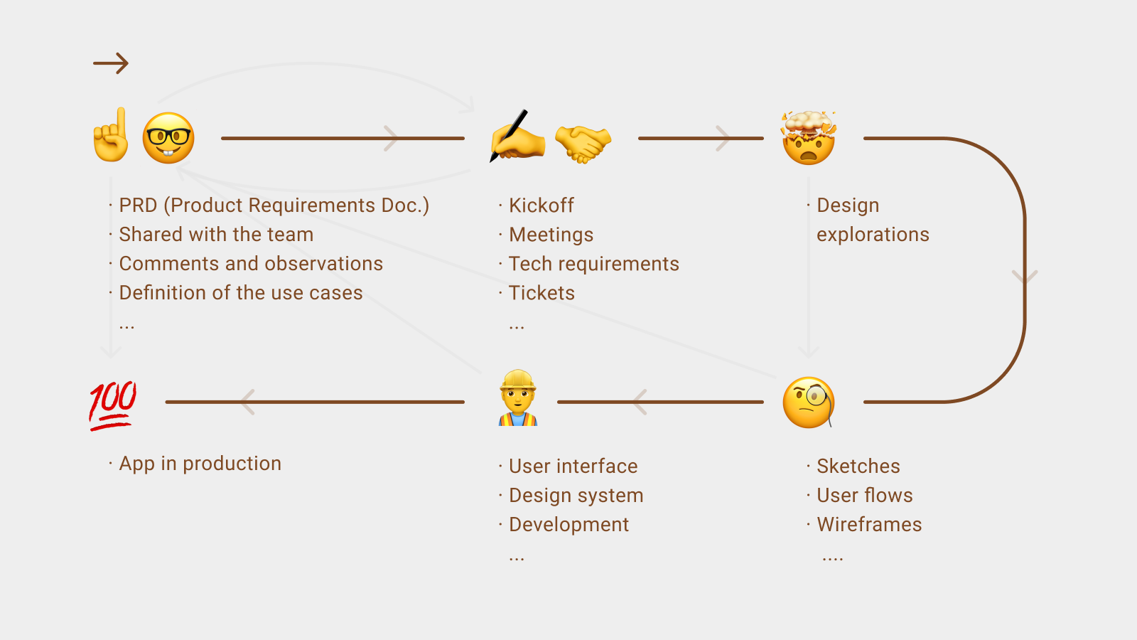
Procces
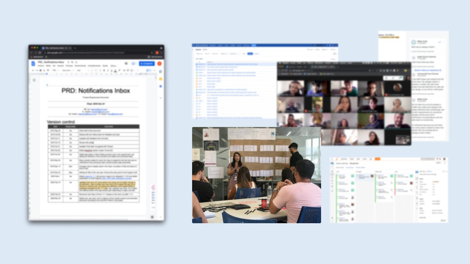
Process to add a new functionality to the app. Image
After having multiple meetings with the team, having sketched different ways to add this feature to the experience, iterate with the design and development teams and to define the user flows within of the app, we designed and applied the standars and components of the design system Mística.
In addition, it was necessary to create several new components to introduce in the library. This was a parallel process of documentation and validation of those with the global design team.
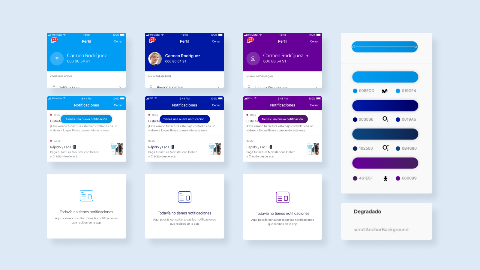
The application is used by different brands, so any component or screen must be applied in different colors. The design system and any new component that is added to the design system must be studied and documented in order to be applied to other brands of the company in a correct and standardized way.
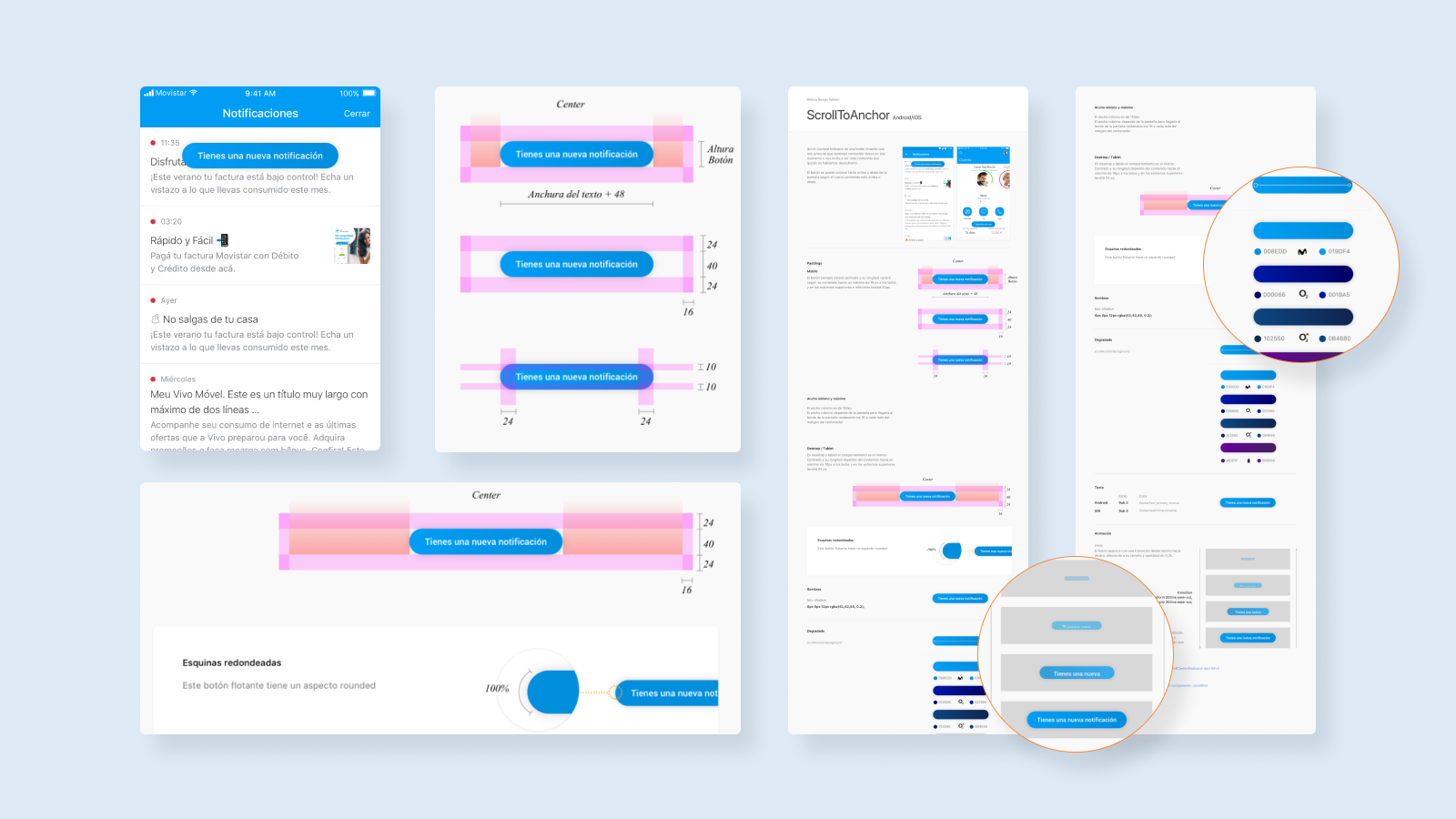
Design specifications of new components added to the system. Image
Design specifications of new components added to the system. Image
In addition to the transfer of the function for its development through Zeplin. It was necessary to add two new components within the Mística design system. For this, in addition to meetings and conversations about its application, it is necessary to document and define the design specifications of each component that will serve, both for the development and design team, when making a correct application of the components.
Teamwork
This design project was executed by a team of two product designers (UX+UI). In the usability and experience side, I worked with Patricia Galán and Carlos de Miguel. My role, in addition to participating in the definition of the feature and its application, mainly materialized in the visual design, the application and ideation of the new components of the design system and the application and support work with the development team.