🇪🇦 Puedes encontrar una versión de este caso de estudio en español en este link
Background
There's a constant need of creating new icons, updates and support while developing of the apps of Telefónica. These assets are fundamentals in multiple flows and screens across different apps. In addition, it's essential that these icons reflect the brand image and harmonize to the rest of components and actions.
On the other hand, internally in the design team, each designer works autonomously but coordinated and together with their product team; and a development team works in a agile way, with established standars and definitions, so it was neccesary to homogenize a process and define patterns for the icons at a global level.
This project was born with the need to create a design system (Mística) that supported the entire ecosystem of digital products and services of Telefónica company. The idea was to have an icon library to support this design system.
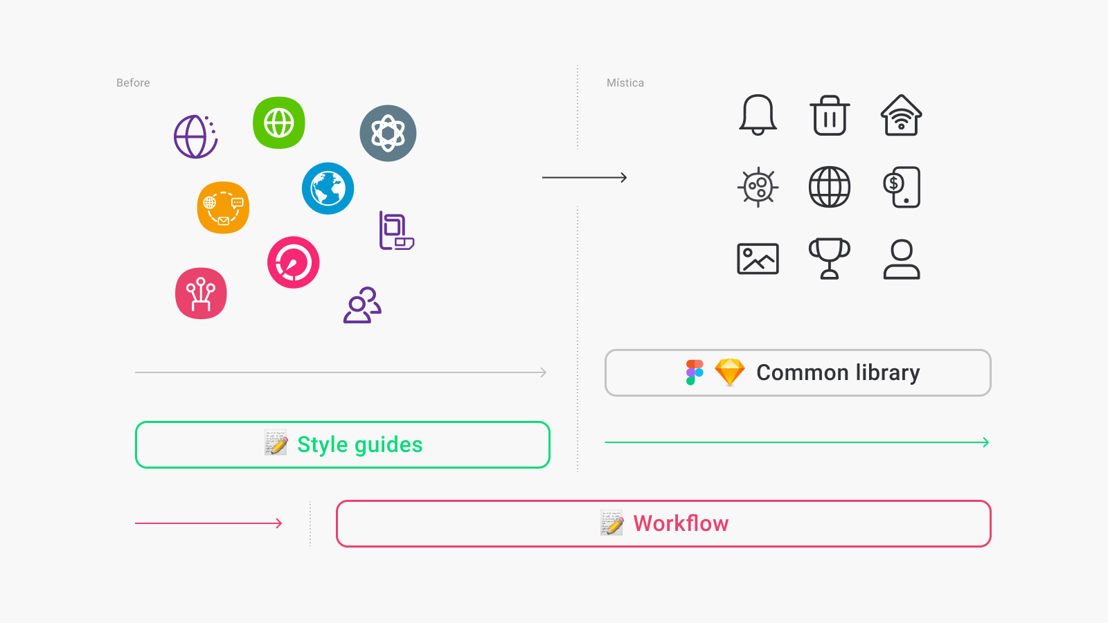
Before this, each brand worked independently, with multitude of designs, patterns and work processes in each team.
Understand the problem
To move steadily from the current situation it was important to establish a series of priorities to achieve the objectives, from the most generic one to the most specific. The idea was to create a stable base on to build the entire system. This meant that we would have to work simultaneously with two different systems of icons during a period of time and two different workstreams until we got to a point of no return, where we shifted to the new one. Thus this process took a while, it coexisted with the rest of projects and was adapted according to the situation.
In general, we can say that the first thing was to establish some style guides, which would help us to give consistency to the creation from that moment on. A common library, where to centralize all the assets that exist to begin to refine them and organize them by tasks. And on the other hand, in parallel a workflow would be documented from the design perspective (creation and use) and another process for the development team (production). With these three parts we would begin to give consistency and logic to all the assets we used.
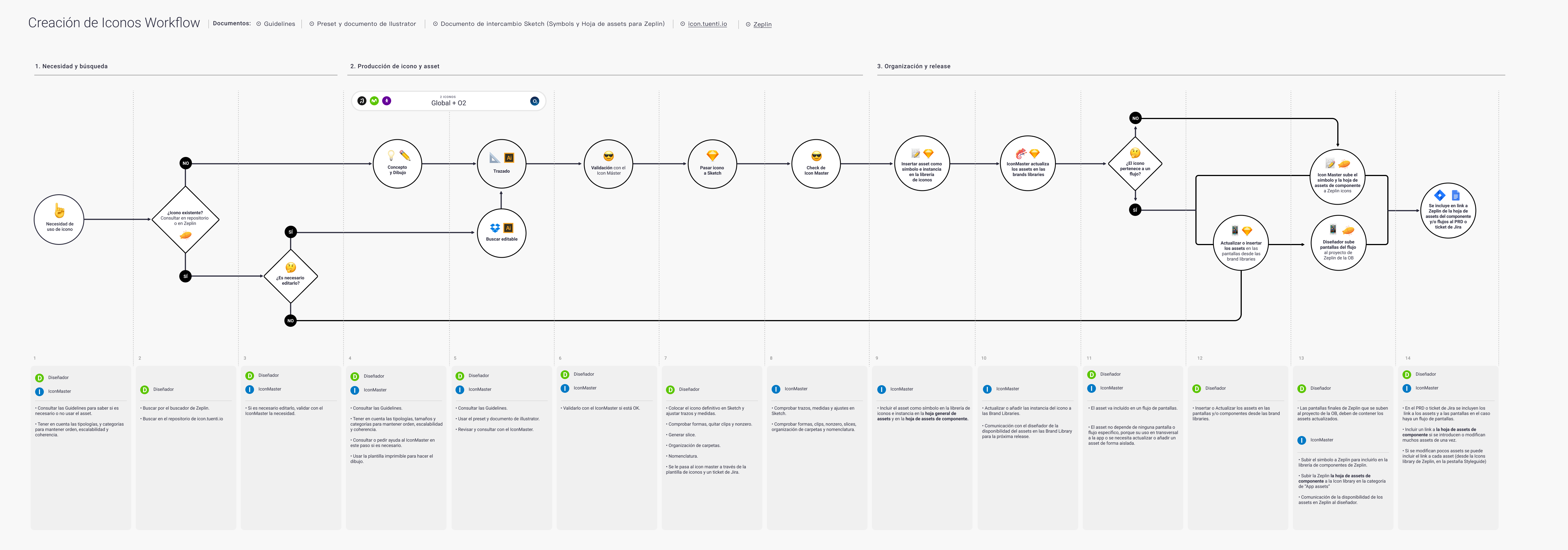
Screenshots of different parts of the process. Style guides, workflow and repository. Image
Main goals
To unify the patterns and style guides for creation and design, taking into account the global brand specifications.
Define a nomenclature of files with meaning and coherence.
Document and define the process of creation, organization, updating and use.
Create assets libraries to use together our design system in a coordinated and meaningful way.
Optimize design and development resources for icon management.
Define with the development team how they use the assets, specifications required for the correct application and optimization. As well as standardization in sizes and colors.
Create an accesible path for the entire product team to a single source of truth, avoiding duplications and questions.
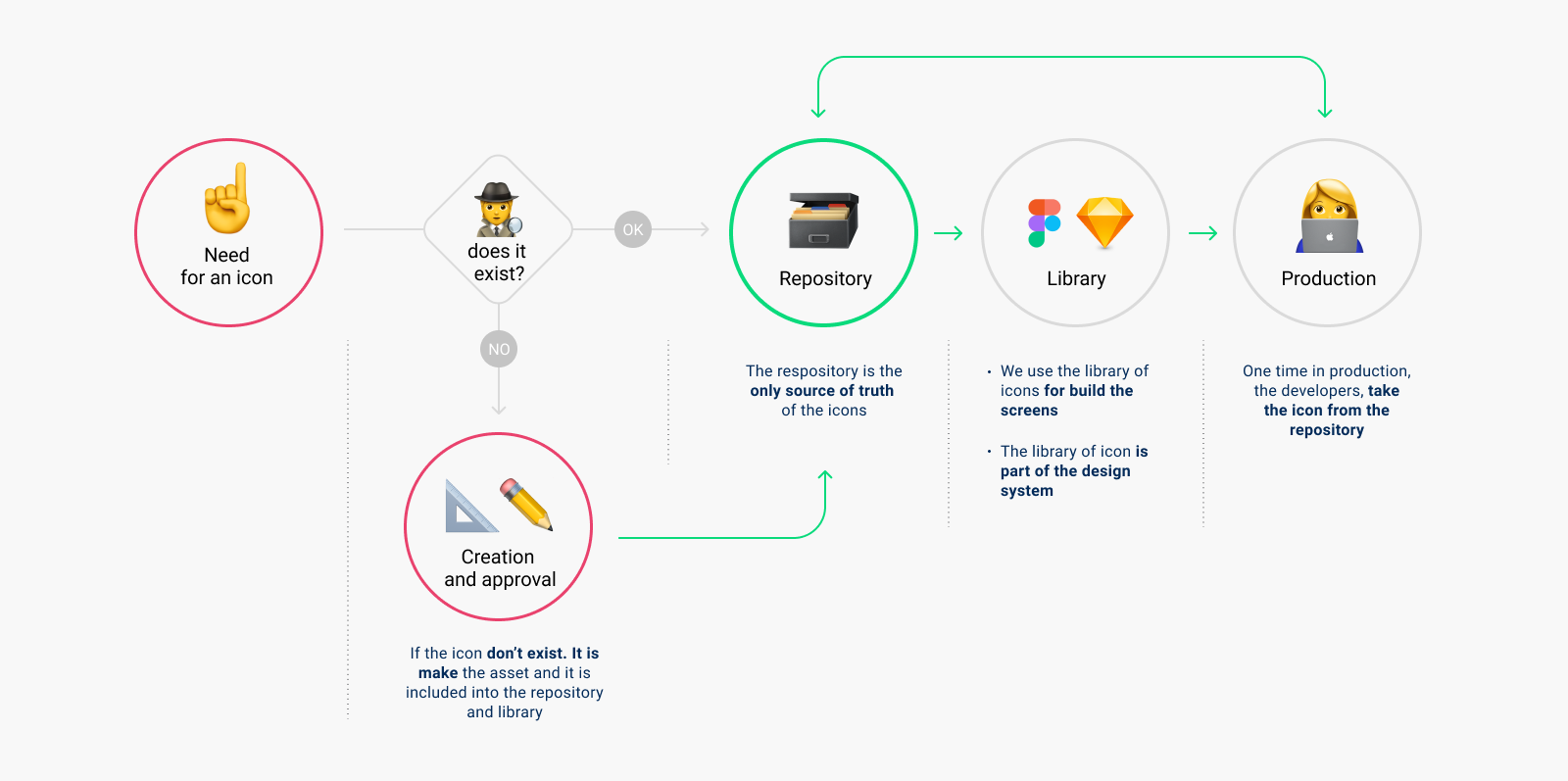
The workflow defines how any designer can create an icon autonomously according to the documentation, how the tasks are coordinated with the icon master, the verification process, how they are exported to include in the repository and finally, how the developers use it.
To get at the definition of this workflow, different meetings were held with the design and development teams until a first version was obtained. But such a document is never final, it's live and continue to improve depending of needs and comments of the teams at all times.
Among all the improvements that were included in the project, one of the main ones was to establish a form of coordination and organization of work. To do this, getting a single place with all the assets accessible from design and development was what brought the greatest benefit to the entire team in this regard.
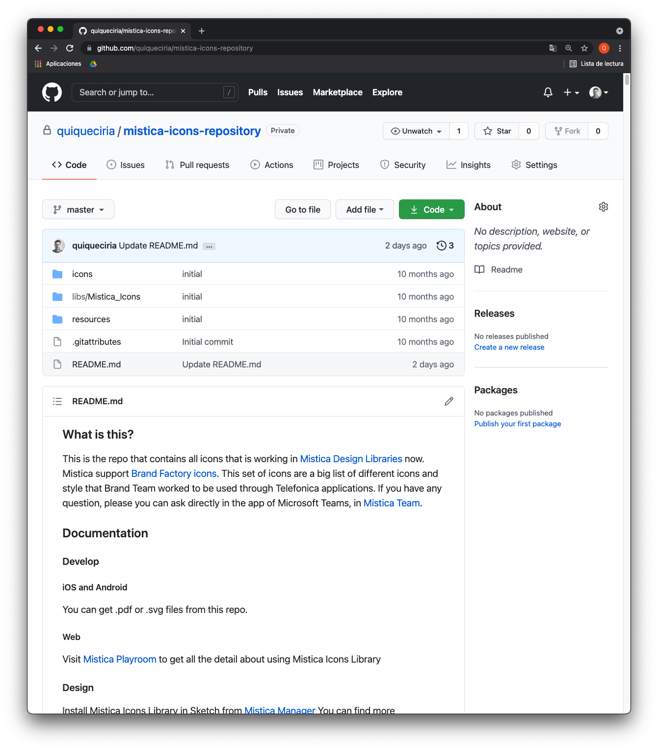
Repository in Github.
As normally happens with internal improvement projects, they need time and this is always scarce because we prioritize external tasks. But it is tremendously necessary to work on internal processes and projects because this has a direct impact on the team and the "visible" work.
Among all the problems that we dragged, one was the one of the different places where the icons could be found (Zeplin, Sketch, StoryBook, etc). From design we knew that it was essential that the icons had one repository only and that this would ALWAYS be the only source of truth regarding doubts, changes and updates. It was also essential that this repository was controlled by the design team, which is on the product side. Not having enough time or designers, we came up with a way to do it from GitHub.
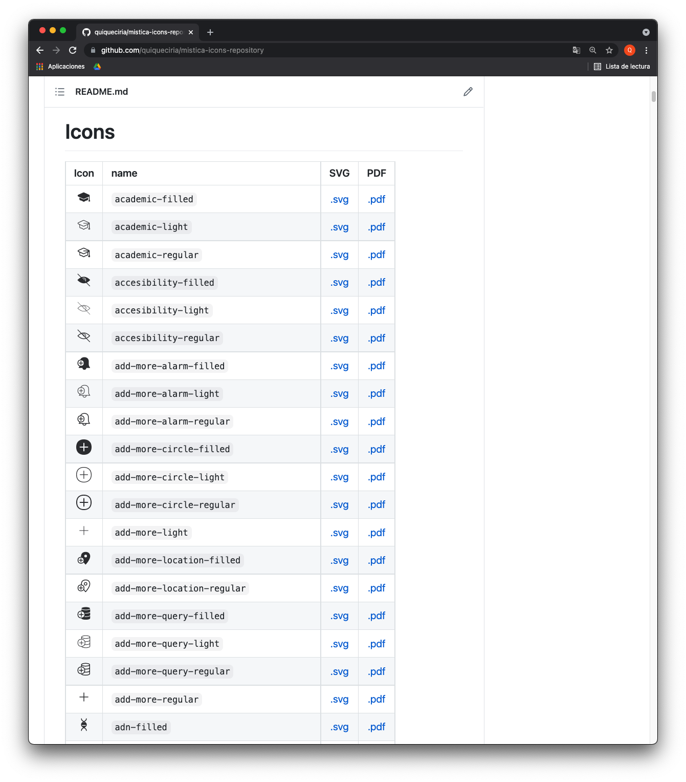
GitHub allowed us to create a quick repository and we managed it in an independent way from the design team. This repository would contain all the icons prepared for production, they would be displayed using the markdown syntax on the main page that would allow us to search using the browser.
By having the entire repository through GIT, we could apply changes and update on a recurring and documented way. GIT is a collaborative system in which anyone can improve an asset by making a pull request. And the development team (who already used GitHub), could either use the icons directly, or link them from the repository to keep them directly updated.
On the other hand, when there is any discrepancy on the version or if it is the appropriate icon, we have a completely updated source of truth accessible from a browser.
Conclusions
When I left the project, a fully functional system was left in sync between development and design:
An icon library was available for Sketch and afterwards for Figma.
There was a repository fully accessible from the web as the only source of truth for development, design and product when checking and using any icon.
Assets were fully prepared to use in .svg and .pdf code from the GitHub repository.
The process of creation, support and production of the icons was defined.
There were style and brand guides for the creation, giving uniformity and coherence to any icon created.
Control points were established to apply improvements to the process and to optimize it as much as possible.
My role as owner of the project was the definition, ideation, coordination and solutions of the problems during the project and adaptation process to the new system and support.